Mobile website users demand a pleasant, easy-to-use, and appealing mobile experience, and a site should promptly provide that.
It’s no secret that people spend more and more time on their mobile devices, therefore the longer it takes you to create a mobile application for your business or firm, the more chances you lose.
Mobile web development includes not just the creation of applications, but also the development of websites designed specifically for portable devices such as tablets and smartphones.
The perfect fit of websites to mobile phone screens is achieved by responsive web design, which prevents consumers from being slowed down by trivial concerns like the layout.
Given today’s mobile world, in which the usage of smartphones has exceeded the use of desktop computers, developing a site optimized for smartphones is a requirement for every business.
9 Ways to Optimize a Mobile-Friendly Site
A website that has been optimized for mobile devices automatically changes its layout. It not only ensures that the site displays properly on smaller screens, but it also helps the website much simpler to navigate.
The layout is reformatted, the navigation buttons are enlarged, and the graphics are resized, all according to screen size.
The website’s mobile optimization is critical for high search engine rankings.
Examples of top mobile websites include Shutterfly and Google maps since they have easy-to-use, very graphic, and accessible designs for both new and returning users.
- Because mobile devices account for more than 50% of all worldwide website traffic, your web page must be Google mobile-friendly.
- Given that 94% of organic search traffic originates from Google, mobile page load speed is a critical factor that Google considers when assessing your website’s search ranking.
- To assess how mobile-friendly your site is and for advice on how to improve it, the internet currently provides free mobile SEO tools— such as HubSpot Website Grader, Google Search Console, etc. If you want to know more about free SEO tools, read more here.
SEO-friendly websites are important since they keep visitors on your webpage longer, which helps your website’s rating in search results.
Implement responsive design into the design of your website to produce a more optimal site.
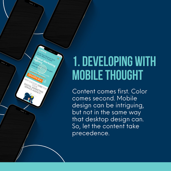
1. Developing with mobile thought
The web was designed primarily to serve desktop users. The actual web, the genuine technological developments, is best exhibited on a magnificent full-screen monitor.
However, mobile phones and other mobile devices are now the norms, and it is time to begin embracing the concept of mobile-first design.
Content comes first. Color comes second. Mobile design can be intriguing, but not in the same way that desktop design can. So, let the content take precedence.
Make sure that the copy and other material components are clear and easy to read. Distracting graphic features are far less lenient on a mobile screen.
Prioritization. The available display area on mobile displays is limited. Additionally, content is shown on mobile phones vertically rather than in the much wider horizontal format found on PCs.
This implies that priorities must be used when planning. What components should consumers notice first and foremost?
Simple to use navigation. The homepage cannot be reached by just clicking anywhere on a mobile device.
That is unless you prepare ahead of time for this kind of navigation. Try out seamless sticky headers in addition to scroll-to-top widgets whenever you’re able to.
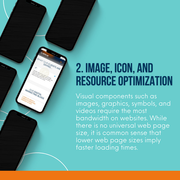
2. Image, icon, and resource optimization
Visual components such as images, graphics, symbols, and videos require the most bandwidth on websites. While there is no universal web page size, it is common sense that lower web page sizes imply faster loading times.
So, how can you cut a few KBs or even MBs from your visuals?
- Resize your image – Depending on the proportions you require, resizing can save up to 80% of the total image size.
- Reduce file size with compression – This could be done to the point where your photographs retain their inherent quality while having their file size considerably reduced.
- Explore alternative file formats – PNG and JEPG are the web’s image standards. However, the most recent and cutting-edge technology in digital picture distribution revolves around the WebP and SVG file formats.
SVGs, for example, may resize to screen size automatically, lowering the number of resources required to load individual graphic components.
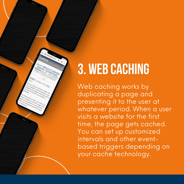
3. Web caching
Web caching works by duplicating a page and presenting it to the user at whatever period. When a user visits a website for the first time, the page gets cached.
When a new user attempts to view that page, the HTTP server will deliver the cached version rather than the live version.
The purpose of any type of caching is to increase website performance while reducing the number of back-end resources required.
You can set up customized intervals and other event-based triggers depending on your cache technology.
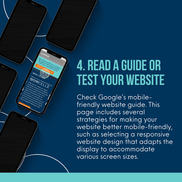
4. Read a guide or test your website
Check Google’s mobile-friendly website guide.
This page includes several strategies for making your website better mobile-friendly, such as selecting a responsive website design that adapts the display to accommodate various screen sizes.
Moreover, run Google’s Mobile-Friendly Test to determine how mobile-friendly your website is.
You can test one page on your website or some pages to discover exactly how Googlebot interprets the pages while deciding on search results.
Also, create a Mobile Usability Report with Webmaster Tools to detect any flaws with your site when accessed on a mobile device.
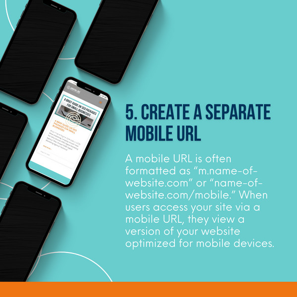
5. Create a separate mobile URL
Many businesses will build separate mobile URLs when optimizing for mobile. You can establish a duplicate site for mobile users by using a separate mobile URL.
It enables you to design a unique experience for customers who access your website via mobile devices.
A mobile URL is often formatted as “m.name-of-website.com” or “name-of-website.com/mobile.” When users access your site via a mobile URL, they view a version of your website optimized for mobile devices.
This modification allows users to interact with your website.
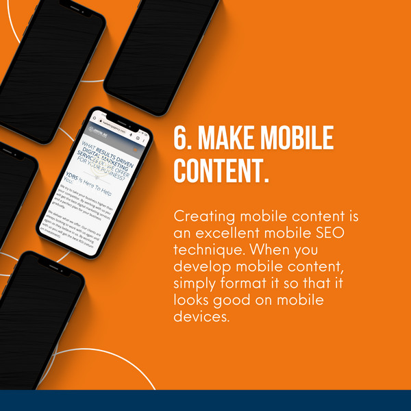
6. Make mobile content.
Creating mobile content is an excellent mobile SEO technique. When you develop mobile content, simply format it so that it looks good on mobile devices.
Make it simple for users to browse through your content if you want to develop mobile-friendly content. Keeping paragraphs to 2-3 sentences, for instance, will make it simple for your readers to scan or read through your text.
You should also include photographs and videos in your article. Your content will stay engaging and provide opportunities for viewership.
You should also include interactive components, such as interactive buttons, to make it easier for consumers to navigate your mobile site.
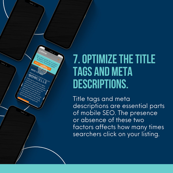
7. Optimize the title tags and meta descriptions.
Title tags and meta descriptions are essential parts of mobile SEO. The presence or absence of these two factors affects how many times searchers click on your listing.
Because mobile consumers seek information quickly, they will frequently use your title tag and meta description to evaluate whether or not to click on your listing.
Title tags
In search results, title tags are the initial thing your viewer sees. Your readers will know what your website covers thanks to these tags.
As a preview of your page, these title tags are used. If you want to generate more meaningful mobile traffic to the website, you should optimize the title tag.
A good title makes use of your keywords. To let your viewers know that your listing is related to their search, your keyword should be placed first in the title tag.
Your page’s title tag should describe what your viewers will find on the page and provide information about it.
Meta description
The short phrase that appears following your title tag is your meta description. It offers more details about your listing than what your audience already knows.
The audience can get a sneak peek at your page from your meta description. They can use it to judge whether your page is pertinent to their search query. If you have a brief and descriptive meta description, you will attract more mobile visitors to click on your website.
8. Optimize for local
Local SEO is an important component of mobile SEO. Mobile searches for the phrase “near me” have increased threefold in the last few years, indicating that consumers are increasingly looking for local companies.
To identify local businesses near them, people frequently use terms like “near me,” “open now,” and “where can I buy.”
Because so many individuals use local words when searching on mobile, you must alter your method of reaching these folks.
Because so many individuals use local words when searching on mobile, you must alter your method of reaching these folks.
Local keywords might help you adapt to local searches. A local keyword would be something like “auto detailing services in River Islands, CA.”
When looking for a local auto cleaning shop, people are likely to search “car detailing services in [city].”
Utilizing local keywords will increase your chances of appearing in local search results. It’s an excellent method for enhancing your mobile SEO strategy.
9. Target mobile traffic and decrease the load time of your website.
A website’s or online business’s long-term performance depends heavily on targeted traffic.
Users that come to your website with a particular objective in mind are more likely than ‘regular’ users to take an action.
For several reasons, mobile traffic is crucial, because the more users visit your website, the more prospective visitors you will have.
The load time of your website is an important aspect of the mobile experience. When users look for information on the go, they want it fast. If your website does not load quickly enough for your visitors, they will go.
You must optimize your site’s load time if you want to maintain visitors on your mobile site. Google PageSpeed Insights can offer you information on the load time of your website.
We currently live in a world that is dominated by mobile devices. Because the vast plurality of web users rely on mobile devices rather than desktop computers, you must carefully evaluate how your site functions and appears on smaller displays.
Optimizing your website so that it works well while remaining user-friendly on mobile devices is necessary, particularly if you want to avoid being disadvantaged by search engines.
When you use WordPress, you can easily optimize your webpage for smartphones. Making sure your designs appear good on mobile devices and using the appropriate plugins and themes can help you a lot. When combined with tools like the Google Mobile-Friendly Assessment, it’s quite easy to develop a site that looks great on smaller screens.
It’s not that difficult to optimize your website for a seamless mobile experience. Just a little resolve and a willingness to put the ideas in this article to use are all that is required.
If you don’t have experience with coding or don’t have the time to modify your site to make adjustments, you can hire a mobile-friendly website design agency to improve page performance and SEO ranking. Schedule a call with YDBS and let us assist you.


Bea Manzano
Bea have always been passionate about writing even at a young age. What started out as a hobby soon became her career. She has written blogs and articles for different industries such as Real Estate, Lumber Companies, Home Decors, Cat Hotels, Travel Industry, and many more. When she's not writing, you can find her either at home watching her favorite TV series while sipping milk tea or outdoors going on roadtrips with her family.


